Extreme close-up from above: a thumb mid-tap on a single-screen Android UI on a dark phone, clean studio light with sharp shadows, minimal interface visible — one clear action button in the frame
/ How We Work

Clarity is earned. We do the subtracting.

Every screen we ship has been through a removal pass, not just a build one. Fewer decisions on screen means more confidence in the hand.

Wide flat-lay on a white desk: an Android phone next to a printed wireframe grid with handwritten notes at the margins, high-contrast north-facing window light, no people visible
Close-up of a hand holding an Android phone, thumb hovering over a minimal UI with two visible options, clean studio light, sharp focus on the screen edge and thumb position
Overhead shot of a hand holding a phone on a subway pole, screen showing a simple single-action interface, ambient daylight, motion slight in the background — focus on the device and hand grip
— Three passes

01 — Map every decision

Before a single screen, we list every choice a user will face. Interaction radius, one-hand reach, and tap target logic come before visual hierarchy.

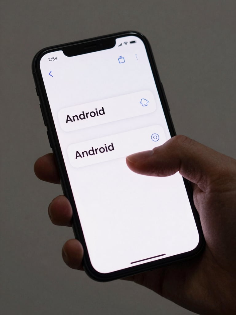
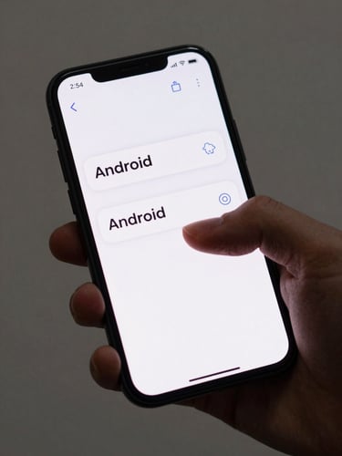
02 — Remove until it resists

Each feature passes a subtraction test. If removing it breaks a real flow, it stays. If it only feels safe to keep, it goes.

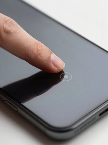
03 — Test in the thumb zone

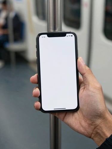
Usability testing is physical. We watch where thumbs go under real conditions — commute light, one hand, distracted. Then we iterate.

Getting to simple takes longer. That's the work.

We don't ship lean because we cut corners. We ship lean because we ran every layer through a hard question: does this earn its place on screen?

Ready to remove what doesn't belong?